Navigating "NextGen" Upland Analytics
Beginning in January 2022, Upland Analytics will be getting a newly-refurbished look and feel. This new "NextGen" design will make it easier for users to find and organize the reports, graphs/charts and dashboards that help them monitor trends, identify gaps and make strategic decisions.
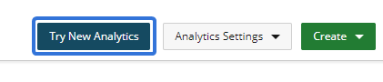
To explore this new version of Upland Analytics before its official release, select the Try New Analytics button in the top right-hand side of the Upland Analytics screen:
Note: The previous version of Upland Analytics is now known as Analytics Classic. It can be accessed at any time by selecting Back to Analytics Classic in the top right-hand corner of the "NextGen" screen:
For now, you will still need to use Analytics Classic to create any new reports, graphs/charts or dashboards in Upland Analytics until the "Report Writer" version is released.
This page will familiarize you with the "NextGen" Upland Anlaytics interface before it becomes a permanent part of Eclipse PPM.
Tip: For additional help with "NextGen" Upland Analytics, select the Help  or Tutorial
  icons from the Analytics Menu. Also, see the New Analytics Help Center for more information.
This page covers the changes to the following components of Upland Analytics:
For information on creating "NextGen" Upland Analytics reports for Eclipse PPM, see Building Reports in "NextGen" Upland Analytics.
Home Page
Similar to Analytics Classic, the Home page is the first thing you see after clicking the Upland Analytics icon from the Navigation Menu. The classic version of the Home page has gone through a major transformation with the new update.
Previously, the Home page would display an existing report, graph, chart or dashboard specified by the user. The user's folders could be accessed by selecting the Analytics menu on the left-hand side of the page:

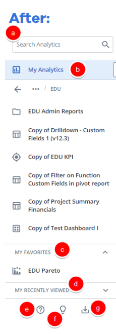
The "NextGen" Home page features a more intuitive design. It now displays a user's most frequently used reports, graphs/charts and dashboards, as well as a list of favorites:

The new Home page consists of the following panels:
-
My Recently Viewed: This panel consists of your last eight reports, graphs, charts and dashboards that you have viewed in Upland Analytics.
-
My Favorites: This panel consists of the reports, graphs, charts and dashboards that you have saved as a favorite.
Tip: You can rearrange your favorites by clicking the three-dot icon
 and selecting either Move to Top or Move to Bottom. You can also drag and drop any of your favorites by clicking and holding the six-dot icon
  .
. -
My Reports and Dashboards: This panel contains all of the reports, graphs/charts and dashboards that you have access to. You can filter these items using one of the three tabs at the top of the panel: Reports (including graphs and charts), Dashboards or Folders. You can also use the search bar to directly search for any accessible items.
Note: If you cannot find an item that you are looking for, contact your Eclipse PPM administrator to ensure you have been given access to it.
Analytics Menu
The Analytics Menu has been upgraded with a more intuitive design that includes more tools and options for users while eliminating clutter.
Note: Each user's profile is uniquely configured by the Account Administrator. Your Analytics Menu options may differ slightly. Contact your Eclipse PPM Administrator if you would prefer a different layout.
The previous Analytics Menu listed all of the folders and items that the user had access to. If completely opened, each folder level would display on the menu:

The "NextGen" Analytics Menu (which can still be opened with an arrow icon  on the left-hand side of the page) only displays one folder level at a time, which gets rid of the messiness that comes with multiple levels. It also offers additional functions that the previous menu did not support:
The new Analytics Menu consists of the following:
-
Search: Type in the name of a folder, report, graph/chart or dashboard that and the search results display directly below in the document tree.
-
Document Tree: This displays all of your available folders, reports, graph/charts and dashboards directly below. You can select any report, graph/chart or dashboard to open it up on your screen. Also, you can select any folder to view its content directly in the menu.
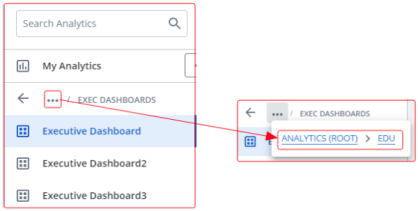
Tip: When you select something from the menu, you can click on the three horizontal dots to view the breadcrumb trail of folders that it belongs to:
-
Favorites: This section displays the reports, graphs/charts and dashboards that you have saved as favorites.
-
My Recently Viewed: This section displays the reports, graphs/charts and dashboards that you have recently viewed.
-
: Selecting this icon opens up the online help for the new Upland Analytics interface.
-
: Selecting this icon opens up a tutorial for the new Upland Analytics interface.
-
 : Selecting this icon opens up the Download Manager, which contains the queue of documents that you have downloaded during your current session.
Reports, Graphs/Charts, and Dashboards
All of the reports, graphs/charts and dashboards that you have permissions to in Analytics Classic can still be accessed within the "NextGen" Upland Analytics interface.
In Analytics Classic, all items in Upland Analytics displayed a needless amount of buttons that were not very popular with users. All of these buttons would crowd the screen and distract users from the most useful functionality:
Within the "NextGen" Upland Analytics interface, this crowded menu has been condensed into only a few icons. Also, the items have been given a cleaner look and feel:

While viewing an item, users can now select any of the following:
-
 Favorite: Select this icon to add the item as a favorite. Favorites can be easily accessed from the Home page and the Analytics Menu.
Note: Colored stars
 indicate that the item has already been added as a favorite. Clicking on a colored star will remove the item from your favorites list.
 -
 Filter: Select this icon to open the filter pane on the left-hand side of the screen. A colored filter icon
  indicates that a filter has already been applied. See Filters below for more information.
 -
 Refresh: Select this icon to refresh the data in the report, graph/chart or dashboard. Hover over this icon to see the last time the data was refreshed.
 -
Menu: Select this button allows you to either Download the item or Send it by Email. Items can be downloaded and sent in the following formats:
-
CSV
-
XLS
-
PDF
-
PNG (graphs/charts only)
-
JPG (graphs/charts only)
Also, Dashboard menus can open up Presentation Mode, which works the same as it did in Analytics Classis.
Note: For dashboards, the menu can be opened for each report or graph/chart within the dashboard or the dashboard in its entirety.
-
-
 Sort (reports only): Select this icon to sort the independent values of a report in ascending or descending order.
 -
Quick Filters (dashboards only): Dashboard quick filters are displayed at the top of the page as well as in the filter pane on the right-hand side of the page. For more information, see Quick Filters below.

Download Manager
The Download Manager is exclusive to the new Upland Analytics interface. Whenever a user downloads a report, chart/graph or dashboard, the file is sent to the Download Manager. The Download Manager displays all downloaded files from your current session, both pending and ready for download. You can open up the Download Manager at any time from the Analytics Menu.
Previously, users would select the download button  and the file would be saved directly onto their computer. In "NextGen" Upland Analytics, users will receive two notifications after selecting Download from the menu of an item :

-
The request is pending. This allows them to open up the Download Manager to view all of their downloads from the current session.
-
The file is ready for download. This allows them to download the file onto their computer.
If a file takes a long time to render, the Download Manager automatically opens and displays the name of the report, graph/chart or dashboard and the status of the download:
![]()
Once the render finally completes, a "Ready to Download" notification will still appear. Users have the option to download files from selecting Download File from the notification or selecting the Download button next to any of the listed files in the Download Manager.
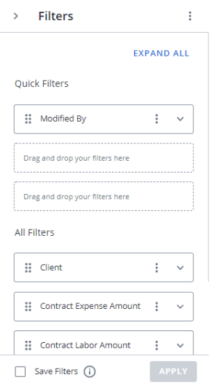
Filters
Adding on-page filters to items in "NextGen" Upland Analytics is done similarly to how it was done in the Analytics Classic interface with only a few differences.
Previously, the filter pane would open on the right-hand side of the screen after the filter button  was selected:

Users could enter values to filter the report by into the textbox (a) and add conditions to their filter by clicking the Conditions button (b).
Similar to Analytics Classic, the "NextGen" filter pane can also be opened by selecting the filter button :

Values to filter the report by can be chosen using the "Basic" textbox (a). To add conditions to a filter, users must select "Advanced" (b) and use the drop-down menu and textbox:

Note: More conditions can be added to a filter by selecting the Add Condition button. Any conditions can be removed from a filter by selecting the  icon.
icon.
Similar to Analytics Classic, filters can be applied to the report by selecting the Apply button and saved as default by selecting the Save Filters checkbox at the bottom of the window:

Quick Filters for Dashboards
Dashboards in "NextGen" Upland Analytics exclusively feature Quick Filters. Users can choose a maximum of three filters to display at the top of the dashboard, allowing them to easily apply and modify the filter values:

The Quick Filters apply to every widget on the dashboard. They are also displayed when the filter pane is opened on the right-hand side of the page.
Note: If you wish to save any Quick Filter values as defaults, you will need to do so using the "Save Filters" checkbox in the filter pane. See Filters above for more information.
Individual filters can be added to the Quick Filter bar using the filter pane. The dashboard filter pane splits the filters into two sections: Quick Filters and All Filters:
The filters under "Quick Filters" will appear at the top of the dashboard and the filters under "All Filters" can only be accessed from the filter pane. Filters can easily be switched back and forth between the two sections by dragging and dropping them by their six-dot icons :
